I’m learning so much and this topic is tricky, so I thought I’d share with you what I’ve discovered. Click to scroll down straight to my guide. Have you ever shared your website link on social media and realised the image that appears along with it is useless? Perhaps it just a random picture off the page, or part of a picture with text that flows off the image? If not, then happy days! But if the first thing that people see on social media is an image that is inconsistent with the message you are trying to purvey, it will reduce the chances of them clicking your link. If you aren’t sure if you should continue reading, then copy the URL / Domain name of your website into a new Facebook post and see what happens. Here’s an example of one that doesn’t work:
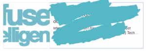
I’ve obscured the link and stuff, but the image Facebook uses looks like “fuse elligen”… What?! When you click the link and go to the website, the image Facebook has decided to use actually says “infuse intelligence!” (see below)

Looking around at various sites while researching this, I found a Vet website which had a lovely slider on the homepage of a family running down the beach with their dog – it’s very eye catching when you visit the website and I’d definitely want to throw my money at them to care for my dog (I actually do use them for my Husky!) However, when their site gets shared on Facebook, the image gets cropped and the dog disappears from the picture, at which point it becomes very weird. Someone seeing it on social media might (consciously or subconsciously) think “What does a family running along a beach have to do with a Vet?”
To solve this, you need to understand a little about how social media sites choose the image. It varies between sites, but the general process is to look for something called an “Open Graph” Image a.k.a. OG Image and if it doesn’t find one of those, then it picks an image off the page at random or sometimes allow the user to select from a few off the page. If you haven’t heard of an OG Image before, it’s an image that can be flagged / pointed at via the Meta of a page (the bit humans don’t see). This can be immensely powerful because you can tell social media sites to use a specific image which might not appear on your page at all! Good eh?
Sites I create allow the setting of OG Images, and on a page-by-page basis too, which is essential if you are publishing content marketing / news articles or running a blog. So let’s say your site has this functionality too. Unfortunately this is where the fun starts.
Some sites take the OG Image and then make a decision based on size. What joy!! For example, if an OG Image isn’t bigger than 1200×630, Facebook will only display the small square version with text next to it, rather than the nice big rectangle with the text underneath. This error is what has happened in the “infuse intelligence” example above.
If you make your image big enough, Facebook makes take a lovely big rectangle from the middle of the image and uses that. If you get it right, it might look like this: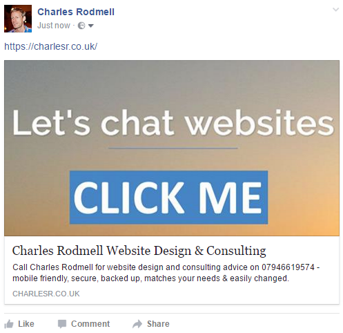
Wow, it looks great like that. Big rectangle. I love it. Bring on the rectangles. So you might think that the best plan is to have an image exactly 1200×630 right? Well, no, because Twitter uses a square image which if set up nicely might look like:
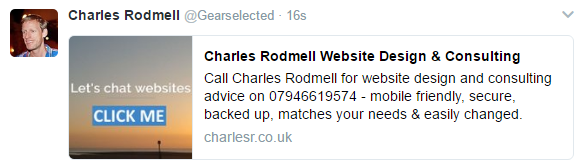
Well, that’s a spanner in the rectangular works. Facebook also messes with the rectangle plan in a similarly annoying way when you post your link in a REPLY to someone else’s post. Here’s what mine looks like in a reply:
See?!?! Square. Bah! Not only that, but the “reply” image on Facebook is tragically low quality (and quite small) in a sort of smearing vaseline on my eyes type way.
If only they could all get their acts together and just use a 4:3 ratio image everywhere we could all just get on with our lives, but since we have to use the hand we are dealt, here’s what I’ve started doing. I don’t think it covers every single type of image that appears in Facebook, but seems to work for the most common types of shares. Maybe there’s a better / easier way. Please tell me in the comments. Please let there be a better way.
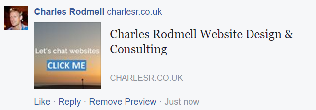
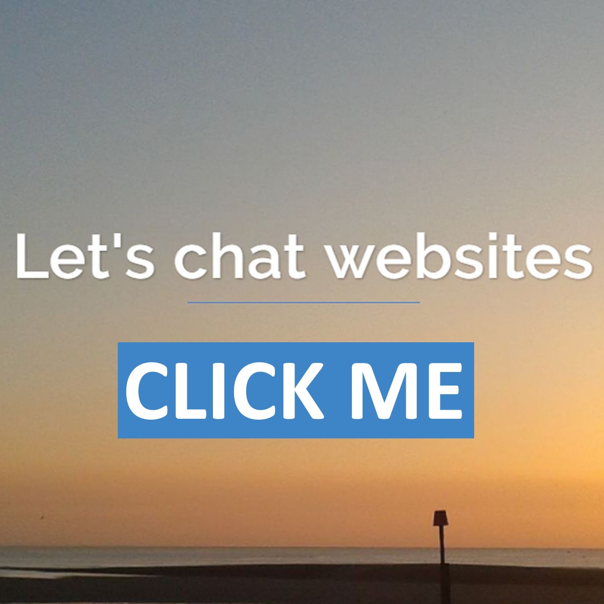
Start with an image that looks good at 1200×630 and increase the canvas to a 1200×1200 square afterwards. Or start with a 1200×1200 image but be certain the 1200×630 bit in the middle has the important info. Here’s my 1200×1200 OG Image. You can see the important bit is in the middle, so I don’t mind if the top and bottom get cropped.
I’ve also added a Call To Action. Just a simple Click Me. Maybe it looks a bit OTT, but it makes it obvious it’s something that SHOULD be clicked if the other surrounding text on the social media post sounds appealing. I’d love to hear your thoughts on whether this approach is good or off-putting.
If you’ve already shared your website on Facebook or Twitter, they hang on to that initial data from the first time it was shared, including the image, unless you force them to check your site again. So if you assign an OG Image or change one, remember to go to the relevant developer pages and ask for an update. Currently, the links are here for Facebook and here for Twitter but searching for “Facebook sharing debug” or “Twitter card validator” should help if those change at some point.
I now await someone in the comments to tell me my method is completely broken on another social media site that I don’t use 😀
If you don’t know how to assign an OG image on your site’s pages and would like to know, your website creator should be able to help, or send me a message.