If you are using the free version of the excellent Astra theme for WordPress, then you might like to have an Astra sticky header so the menu is always available at the top of the page for your visitors. You can do this yourself in less than five minutes!
There are various plugins that do this, but it’s super easy to do in CSS yourself, not just for the header but for any element.
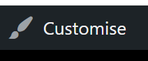
Go to your homepage while logged in and press “Customise” in the WordPress admin bar at the top:
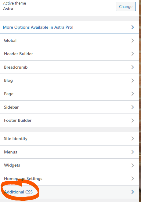
Then press “Additional CSS” near the bottom:
In the box that appears, paste the following code and press Publish at the top of the page:
/* sticky header */
.site-header {
	top: 0;
	position: sticky;
	width: 100%!important;
}
If you are using cache on your site, you’ll need to clear that before visitors can see the results – check in an incognito window.
The CSS code for the Astra sticky header will work on both desktop and mobile versions.
Explanation for that Astra sticky header CSS:
The first line is a CSS Comment – anything within the /* and */ will be ignored, so you can write whatever you want in there.
“site-header” is the class of the header div element. So we put a “.” at the start to say we are looking for a class.
Then everything within the curly brackets { } is what we want to be applied to the site-header.
top: 0 means it needs to be applied to the top of the page.
position: sticky means hold the element in place while you scroll.
People used to use position: fixed, but this didn’t apply any adjustment to the following content, so you’d have to adjust for the overlap with further code. position: sticky is much more simple.
width: 100%!important; This line makes sure that even if drag a tab from one screen to another or turn your phone from portrait to landscape, the stuck header resizes properly. I found I needed the “!important” override on some sites.
What if I’m using the Astra Transparent Header?
I’ve never found the Astra transparent header to be very usable with a sticky header because of the way websites have different coloured content on the way down. If you really want to give it a go, you’ll need to use a different class (.main-header-bar) and position type (fixed).
The code above has “position: sticky;” but this won’t work with the transparent header, so use “position: fixed;” instead. Note that this won’t adjust for the height of the header on things like anchor links that scroll to a Div ID on the same page, so you’ll need to get creative with more code if you are using those.
/* sticky header for transparent header version */
.main-header-bar {
	top: 0;
	position: fixed;
	width: 100%!important;
}
Adapting the sticky header code for other themes:
If you are using a different WordPress theme, the header area will have a different class name, so you’ll need to change “.site-header” in the code to whatever your theme is using for the header element. Use the Chrome Inspect tool to find out.
Running Google Adsense?
Check that your ads don’t get confused by the sticky areas.
worked. thanks <3
Cheers. I’ve just added a note about checking adverts don’t interfere with the sticky areas – I had to disable one advert area on a site recently because it looked odd.
Thank you for this article. The solutions works perfectly.
FYI…The form to fill out under this comment box has some formatting issues for the name and email as they show up as little rectangles (both on Chrome and Firefox)
Cheers Billy. I’ll check it out
Thanks again. It was a plugin conflict. Didn’t happen when logged in though so hadn’t spotted it.
Life saver, that’s what you are.
Hey Sam, just FYI, I’ve added a line to the code so that the header stays responsive if you drag the tab from one screen to another (or turn a phone sideways).
Brother this CSS good work change my site look here my site , thanks
That was super helpful and straightforward😊😊👌
Works well, but I was wondering if there’s a way to disable it for tablet and mobile browsers?
Yes sure. You’d need a “media query” which looks at the screen size and adjusts accordingly. It would depend on what size your tablet break-point is for the site in Astra settings, but let’s say it’s 1024 pixels.
You’d wrap my code above within the following:
@media screen and (min-width: 1024px) { MY CODE ABOVE }
Tried it and that is perfect.
Many thanks.
Super!
That was amazing! I was able to use it for a fixed header too. Check out my site smartsolutionsltd.co.ke
This was the EASIEST way someone has ever explained CSS to me. And it worked! Thank you!
Thanks for the kind words 🙂 Glad it helped you.
This doesn’t seem to be doing anything on my site. I have a transparent header on my Astra theme (I’m also using the plugin Astra Starter Templates), could that be the issue?
Hi. For the transparent header, you’ll need to use “position: fixed;” instead, but I suspect you will struggle to get a level of transparency that works well for the whole site if the header is always visible. You also need to target a different class. I’ve added a section in the article that shows the code. Take a look.
Mine works, but when I scroll and click the toggle button, it doesn’t bring up the drop-down menu. Is anyone with that challenge on Mobile view?
Have you got a test / staging site set up? Send me a link and I’ll have a look.
I added the CSS to my site and the top menu (Primary Menu + Social) is not sticky. Not sure why.
Hi Dennis. It looks sticky to me. I guess you noticed the bit about the code being slightly different for transparent headers.
yes. in case for transparent header the second code works as the header class is different.. I don’t know hot to thank you.. Been to war with header to get him sticky for past 2 days with numerous code, plugin.
Hi Charles, mine doesn’t work 🙁 it isn’t transparent, and surprisingly it does work in block editors but in the final website it just doesn’t happen, I wonder if I did anything wrong?
Did you purge cache? Then try in an incognito window
I’ve tried both already, nothing works 🙁 doesn’t show up no matter the device I’m using, only on the editors strangely
If it’s newsmagic, it appears to be working for me?
Works well, but unfortunately the menu items on mobile are not visible anymore. Is there a solution for this? I tried several CSS options, but so far no success…
Weird, it was working for me on mobile when I last tried this. Got a link to your test site?